Forums
- Forums
- The Workshop
- Works in Progress
- Aluminum world revisited - the B-17
Aluminum world revisited - the B-17
Post a reply
- Go to Previous topic
- Go to Next topic
- Go to Welcome
- Go to Introduce Yourself
- Go to General Discussion
- Go to Screenshots, Images and Videos
- Go to Off topic
- Go to Works in Progress
- Go to Skinning Tips / Tutorials
- Go to Skin Requests
- Go to IJAAF Library
- Go to Luftwaffe Library
- Go to RAF Library
- Go to USAAF / USN Library
- Go to Misc Library
- Go to The Ops Room
- Go to Made in Germany
- Go to Campaigns and Missions
- Go to Works in Progress
- Go to Juri's Air-Raid Shelter
- Go to Campaigns and Missions
- Go to Works in Progress
- Go to Skinpacks
- Go to External Projects Discussion
- Go to Books & Resources
-
 Level 7Gentlemen,
Some wip images of a new b-17 template I'm working (1024 res).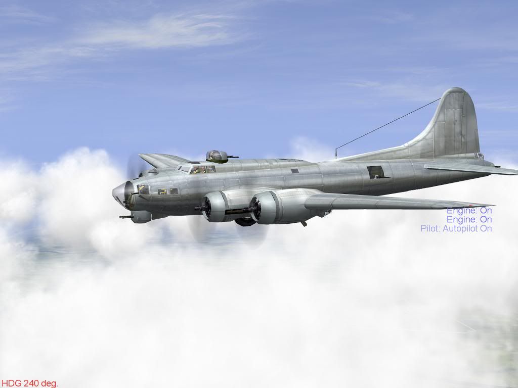
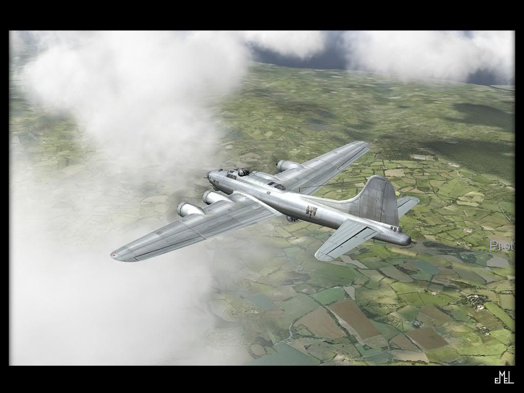
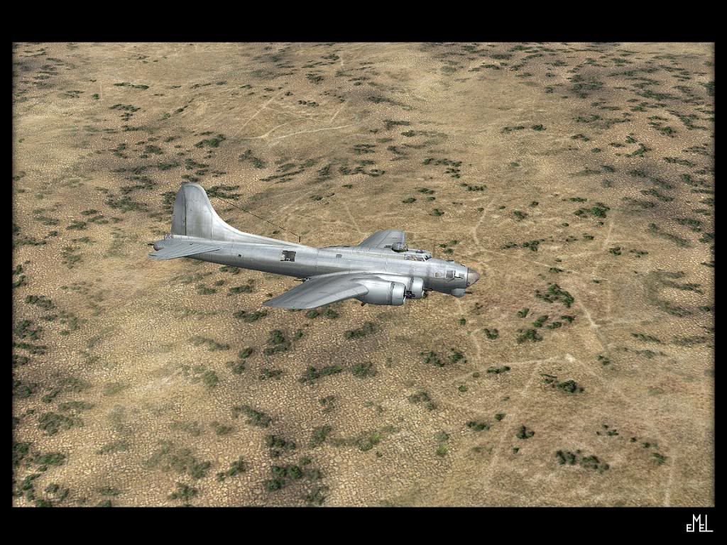
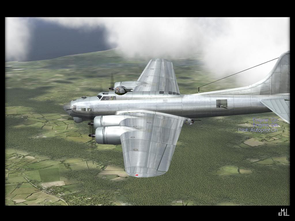
Not ready yet, elevators unfinished. Wing undersides unfinished. Engines undersides unfinished but otherwise well on the way.
-
13 years ago
 AdminIt looks great!!!
ATB
Armin -
13 years agoFri Nov 02 2012, 02:09pm
 Main AdminLooking good Marcus, perhaps a little more colour like a dark blue would add the metal touch more, it?s a bit to grey for my taste.
I?m not an B 17 expert, but for me the tail looks a little bit to much fragmented. -
13 years agoFri Nov 02 2012, 02:41pm
 AdminNice metal and panel-line highlights! I know you're just getting started, so let us know when it's time to start looking for stuff eh?
But so far, a very convincing rendition; nice work mate! ..btw; I would not change the metal tones or the opacity of the highlights; they're spot-on IMO. If this is going to be anything like your Mustangs, it'll be a corker!
Edit: Ooops! Detlef beat me to the 'submit post' button. Just goes to show how preferential these nmf finishes can be. Although, I think Detlef has a good point about the blue tones in regard to altitude. IMO, higher = bluer; just depends how they'll be used in regular missions. In your screenshots, I think the tones look great, but then the shots appear to be at a lower altitude too (no oxygen masks). Something to consider perhaps. -
 Admin
Admin
Boelcke
I?m not an B 17 expert, but for me the tail looks a little bit to much fragmented.
I'd agree with this and say that all the panel line highlights seem a bit strong. Or maybe there just aren't enough of them. Or maybe I just need to see it with rivets done.
I like this photo which shows panel lines and rivets to very good effect for skinning. The B-17 has lots of rivets!
http://4.bp.blogspot.com/_TZ4zYEBSw1I/SNWAaSubsQI/AAAAAAAAFt8/TOYx50T6EG0/s1600-h/b17_flying_fortress_2.jpg
Feel free to ask of you've got any questions, need research resources, or want borrow anything from my template(s)! -
 Level 7Thank you for sharing your views and opinions
About the blue color. It's a good point. NMF textures, imo, when they are static (plain painted ones and don't react with light) are always a compromise. If you want to accentuate a specific color on an object it might greatly increase the immersion on one situation but it may also rob it from another. I've seen this so many times in my projects its really frustrating. That's why I try to pick the most neutral approach when designing colors. I probably wont change the tone of the nmf color in the end, but will tinker with it a bit just to be sure. A couple of screenies with a slightly revised more bluish overall tone. On the elevators you can see the base color upon which everything else is laid on.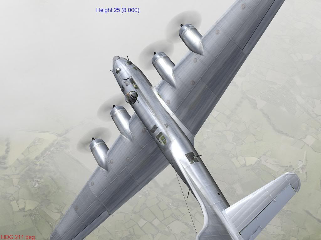
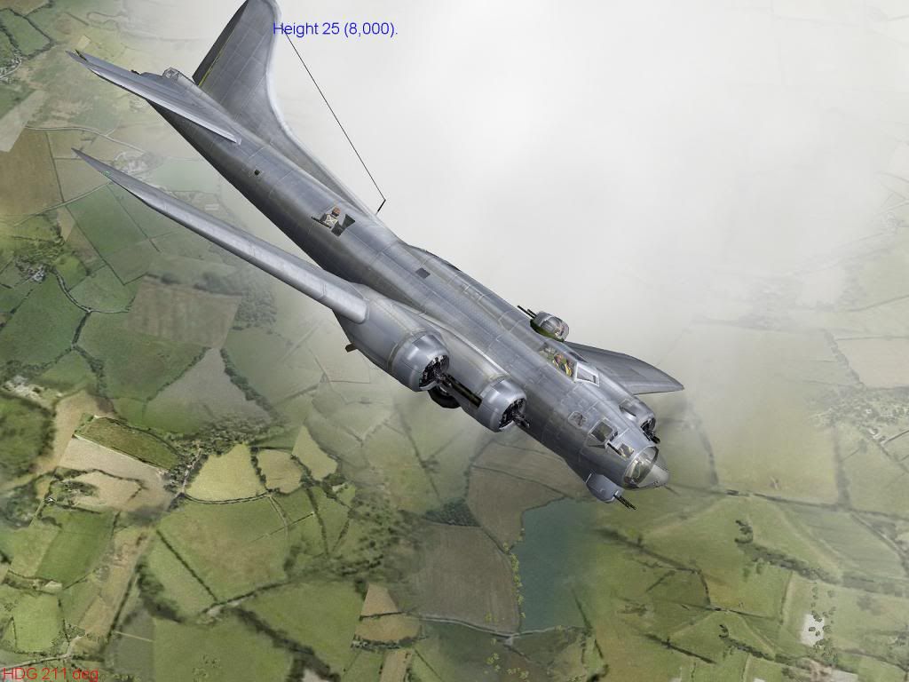
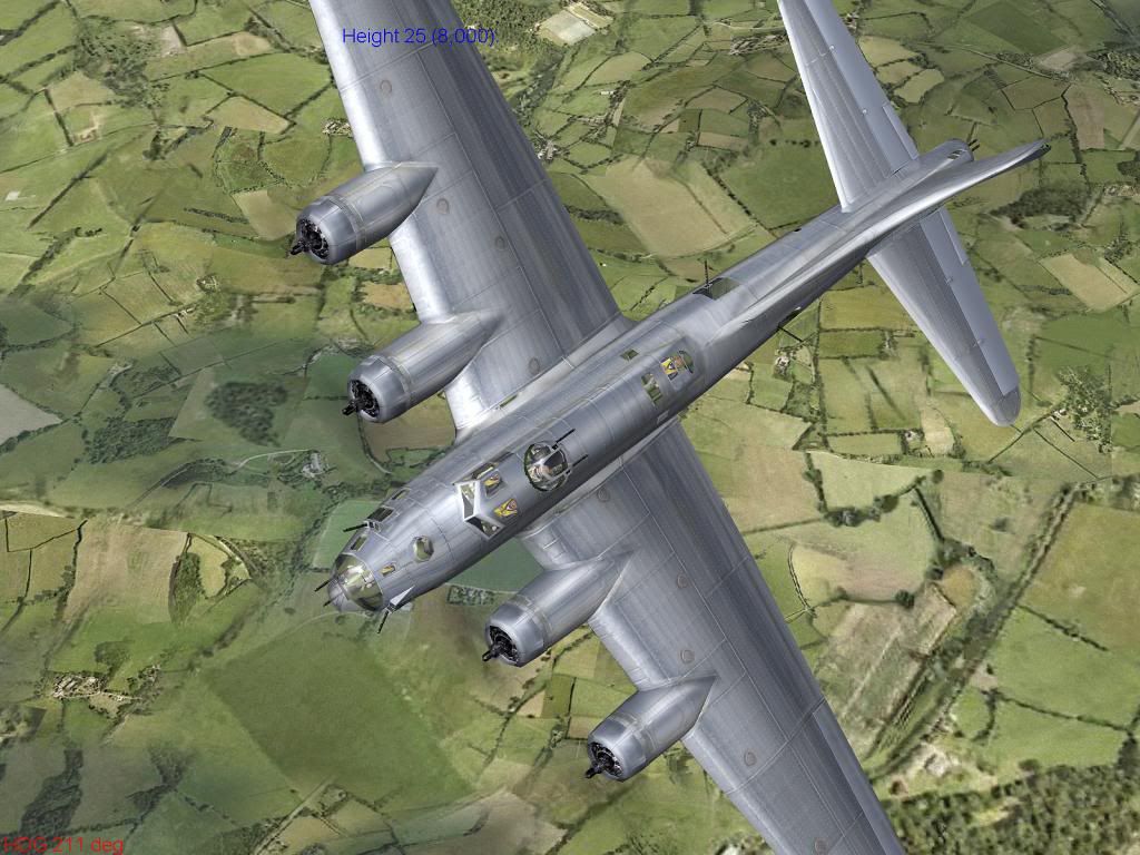
Its not bad, but I miss the stronger highlights, probably will go back to the first version. Pay no attention to the engines and ctrl-surfaces, far from finished
Panel line 'hilights'. I did extensive 'research' at airlinersnet viewing dozens of b-17 images and I'm pretty sure of 'my way', more so the photograph by Jarink, even if it is just a b/w photo, proves I'm close. Minor changes/adjustments will take place, but nothing major. And the rivets actually exist already but I'm not going to bring them out too much, hope the top view of the last image shows what I'm striving for.
These screenies of course don't tell the whole truth. I haven't included any close distance pictures, I hate close shots because any 1024 cgi looks crappy when viewed from close distance, in Il-2 anyway.
Cheers,
Emel -
 Main Adminhmmm, yummie
-
13 years ago
 AdminShe looks really good!
 -
 AdminI'm digging that second pic with the revised coloring. It looks spot-on to me from that angle.
What skins do you plan on making with the template? -
 Level 7hmmm... spot on.... hmmm... I'd still go for the brighter version, reflections look better on it. If I could combine the best parts of the two somehow, get a happy medium so to say. I haven't really desided what skins. The day of large skin packs is over for me, so probably one or two for the twin pack series I guess, which units, too early to say.
Post a reply
- Go to Previous topic
- Go to Next topic
- Go to Welcome
- Go to Introduce Yourself
- Go to General Discussion
- Go to Screenshots, Images and Videos
- Go to Off topic
- Go to Works in Progress
- Go to Skinning Tips / Tutorials
- Go to Skin Requests
- Go to IJAAF Library
- Go to Luftwaffe Library
- Go to RAF Library
- Go to USAAF / USN Library
- Go to Misc Library
- Go to The Ops Room
- Go to Made in Germany
- Go to Campaigns and Missions
- Go to Works in Progress
- Go to Juri's Air-Raid Shelter
- Go to Campaigns and Missions
- Go to Works in Progress
- Go to Skinpacks
- Go to External Projects Discussion
- Go to Books & Resources
